The story
I helped the lovely Morgan Fogler develop her brand identity. She had been a cosmotologist at a salon previously, and was branching off to do her own thing. She wanted a fresh logo to draw in new clients, as well as dazzle and encourage her existing clients to transfer from their previous salon to work with her exclusively.
The vibe provided by Mo: Modern, cozy, balanced between professional and personable. Keeping up with trends; finding sustainable options for services so clients don’t have to come in as often, only at their leisure; high quality products and services without completely breaking the budget
A lot of inspiration was taken from organic or high-end food and beauty brands, doodles, encyclopedia illustrations, modern and sleek natural looks and colors.
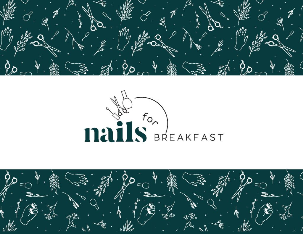
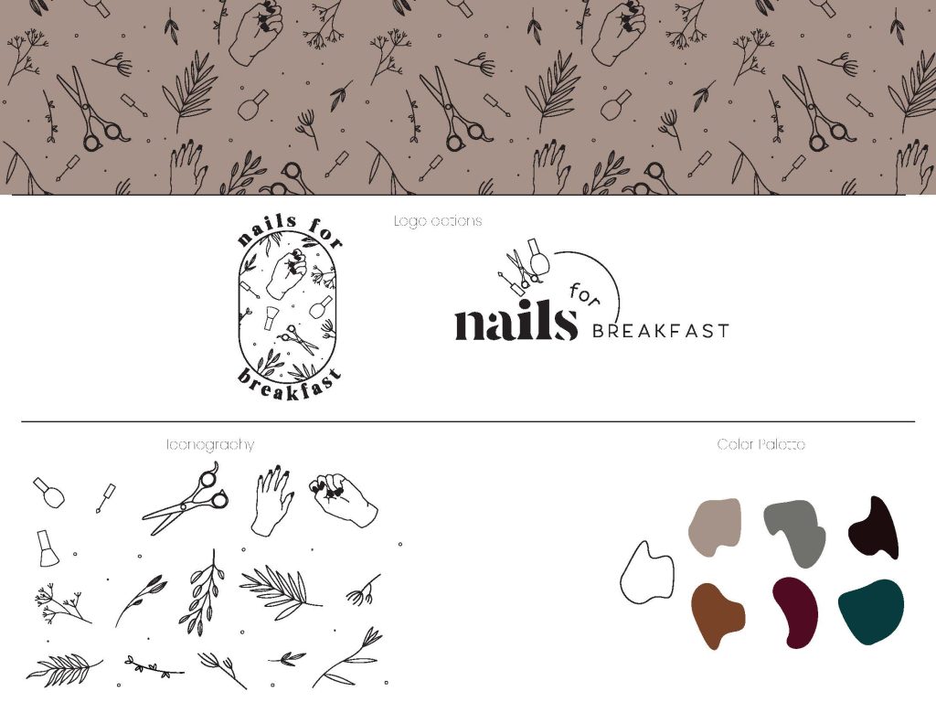
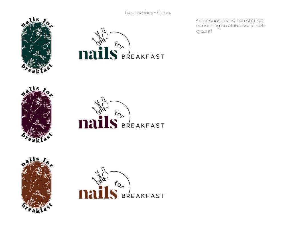
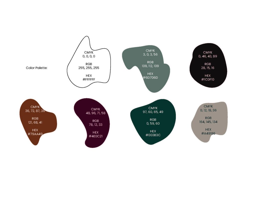
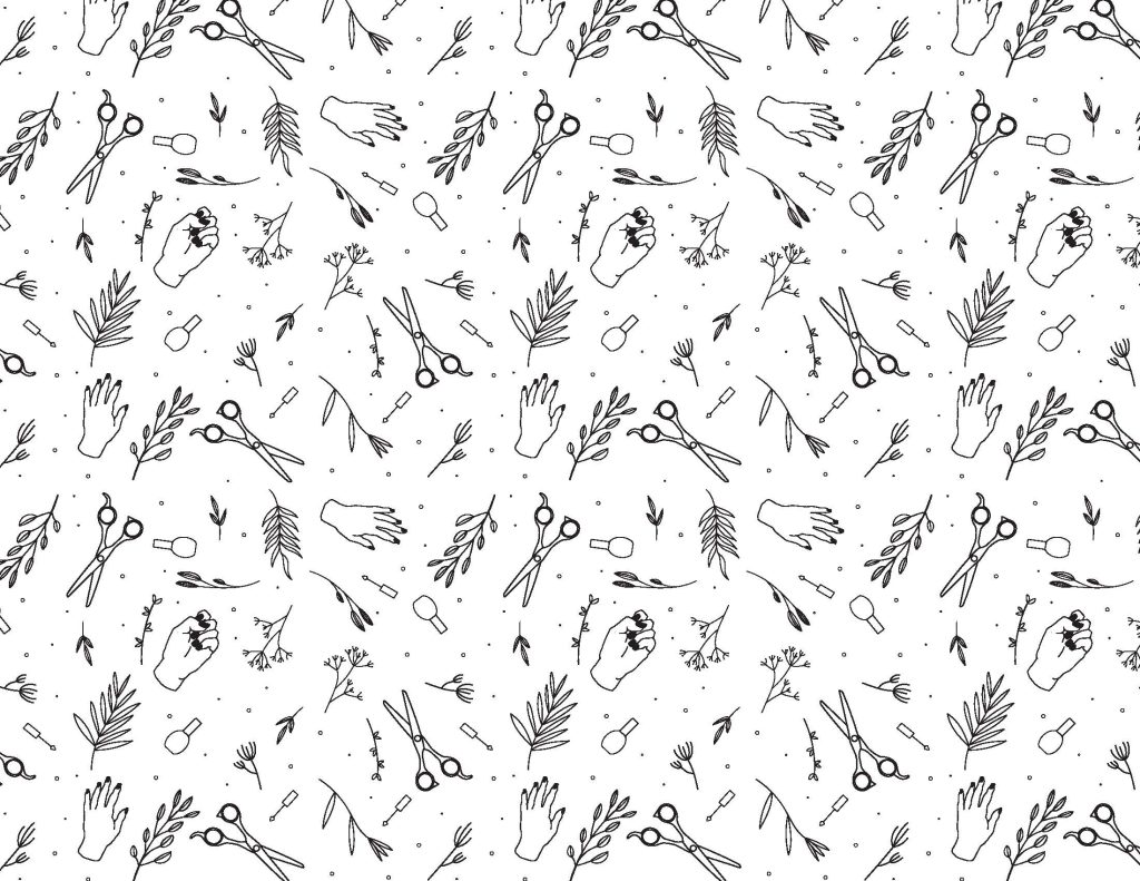
Brand identity and logo design is one of my favorite parts of my job. I developed a few different logo options for her, as well as a few icons and some background patterns. We went with an earthy toned palette, using wine and emerald colors as those pops of color.
I felt that Morgan needed two options for her logo, one that primarily focuses on the text and one that primarily focuses on the iconography. I thought about how she could utilize each logo differntly, using the larger more icon-focused version on social graphics, stickers, or larger print media. The text-focused logo is perfect for any type of media, but I was thinking primarily on her business cards or something that involved more reading for the customer.
The iconography was deeply inspired by encyclopedia illustrations, instructions on the backs of products, old sketches, and a lot of doodles of herbs.
the project
Leave a Reply